OpMAP analysis and visualization of large opinion spaces
Welcome to OpMAP
It may be hard to grasp the variety of opinions on a complex issue. OpMAP helps to make sense of large opinion samples by visualizing them in form of a map. Most people are familiar with geographic maps and even enjoy examining them. OpMAP makes use of the map metaphor to create a highly intuitive visualization that readily unveils the opinion data and its underlying structure.
In order to apply OpMAP to a debate, opinions have to be elicited in a structured way. The simplest way to do this is by means of an online survey.
OpMAP takes as an input the results of such a survey and constructs a map of the opinions that are maintained by the participants of the survey. OpMAP is dynamic, so it continuously updates the opinion map as more people participate in the survey.
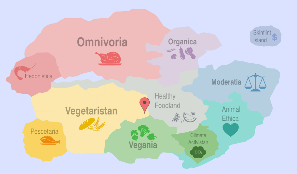
OpMAP can be applied to a debate and the corresponding survey on any topic of interest. The first application of OpMAP is on the debate about nutrition behaviours. As is well known, people may choose a certain diet for a variety of reasons – financial, culinary, ethical and health considerations, amongst others. As a result, there is a vast amount of opinions on eating habits. OpMAP provides a coarse overview on the variety of opinions present in the collected data.
Our work was inspired by GMap, a visualisation algorithm and tool by Stephen Kouborov and colleagues from the University of Arizona.
The scientific methodology behind the construction of the opinion map is described here. Check veggie-debate for the description of the opinion map on nutrition behavioudrs.
Written on August 29th, 2017 by Tamara Mchedlidze